





About Us
CI
Introducing the identity
of POSCO FLOW
Corporate Wordmark
The POSCO wordmark embodies a transparent, responsible, and customer-focused mindset
as well as a forward-looking global vision of transformation and growth.


each letter of POSCO has been arranged in a way that creates balance
to symbolize POSCO’s key principles, including unity and harmonization.
The concentric letters represent POSCO’s aspiration for boundless growth - a vision
to be achieved by responding to external changes and continuing to innovate.
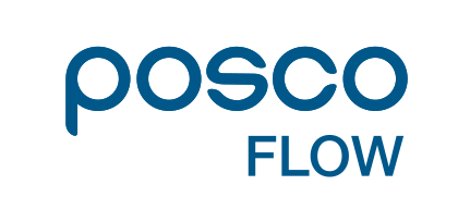
English Version CI
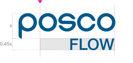
The signature lockup was developed to ensure visual consistency, strengthen organizational unity, and deliver a cohesive POSCO FLOW brand image across all external communications. Careful attention should be given to its use, and the grid system provides the foundation for maintaining consistency in signature construction and proportions.
Korean Version CI
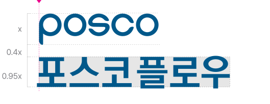
The signature lockup was developed to establish visual consistency, strengthen organizational unity, and deliver a cohesive POSCO FLOW brand image across all external communications. Careful attention should be given to its use. As a general rule, the signature should be reproduced by scaling the original digital source files proportionally. The Korean company name should be positioned at the lower left of the wordmark.

Slogan




Notice
The downloaded files are provided in four variations with either CMYK or RGB color values depending on the intended use. Please use the file that best suits your purpose.
Please download the files for offline use in AI and PDF formats.
 AI
AI
 PDF
PDF
Please download the files for offline use in JPG and PNG formats.
 JPG
JPG
 PNG
PNG
Coperate Colors
The corporate colors represents the unique brand identity of POSCO FLOW. Applied across the signature lockup and other brand applications, it plays a key role in establishing POSCO FLOW’s visual identity.
Main Color
POSCO BLUE
Sub Color
POSCO
LIGHT BLUE
POSCO
DARK GRAY
POSCO
LIGHT GRAY